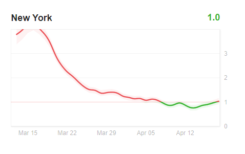
This is a beautiful chart from Rt.live showing the state by state rate of spread of the Wuhan. Higher numbers are bad, lower numbers are good. One of the things that is interesting is that the rate of spread of the contagion had already dropped in most places before the lockdown began.